

Branding and Website Redesign Case Study: Matt Roberts Photography
This branding and website redesign began with a gap: a San Antonio headshot photographer delivering a high-end experience behind a brand that did not look like one. The FOG Digital Marketing team rebuilt the identity and the website around a single idea: the site should feel as considered as the portraits.
Why this website redesign started with the brand
Matt Roberts photographs executives, attorneys, physicians and actors in San Antonio. The portraits were premium. The brand around them was not.
What was working
- A genuinely high-end service, backed by a 5.0 rating across hundreds of Google reviews
- A clear speciality in professional headshots rather than general portraiture
- Strong existing demand from law firms, medical practices and corporate teams
- An owner with a precise vision for how the business should be perceived
What was holding it back
- A logo, palette and type system that read as generic rather than luxury
- A long, undifferentiated homepage that asked visitors to do the sorting
- No separate path for an attorney, a physician and an actor, who book for different reasons
- Calls to action buried below long stretches of copy
- A site that did not signal the price point of the service it was selling
Make the brand match the price point
The instruction that shaped the website redesign was direct: elevate the business to a luxury brand aesthetic that reflects the high-end service being delivered. That meant everything — logo, colours, typography and the website they all live on.
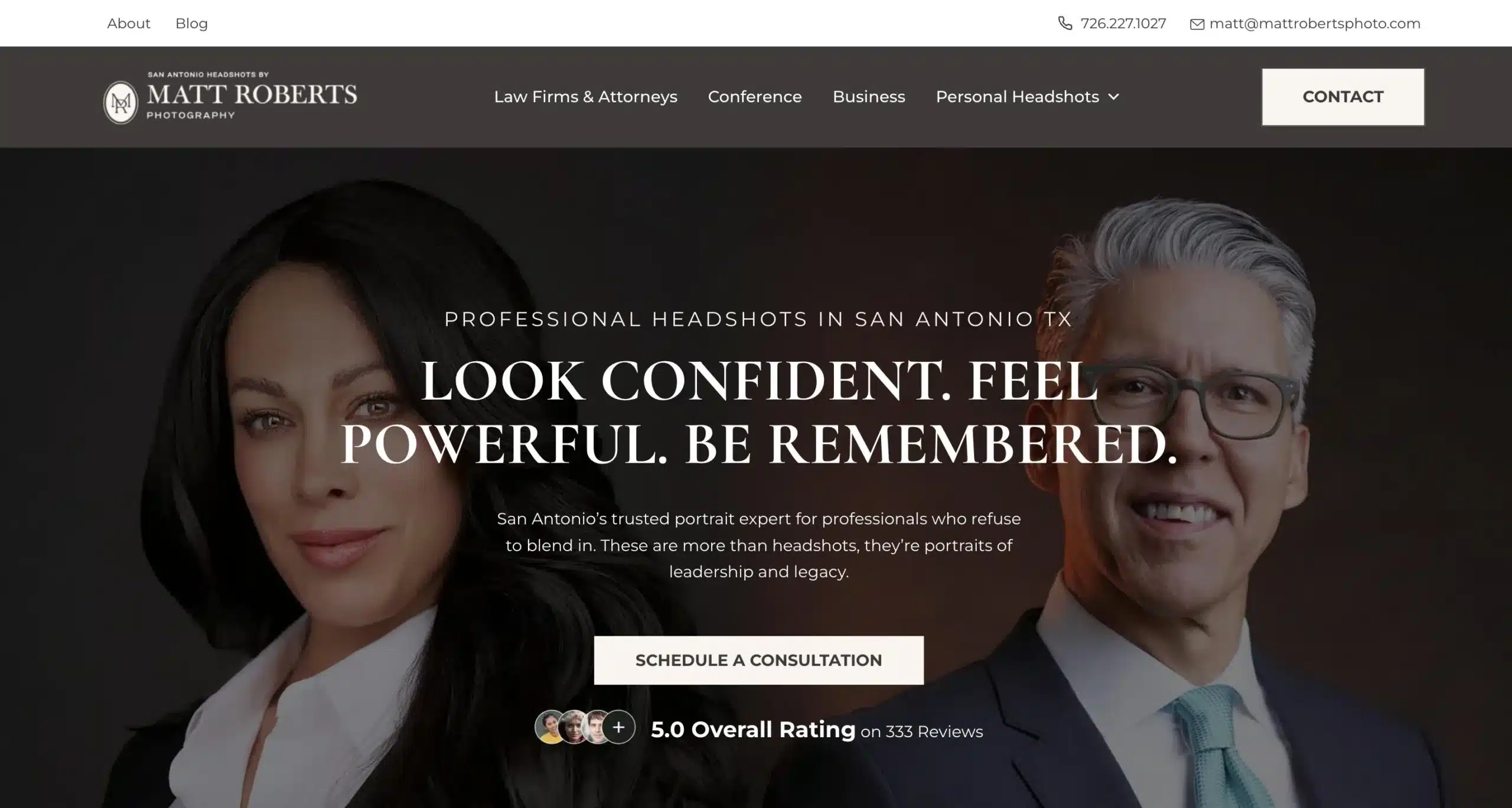
Luxury in a service brand is not gold foil and a script font, and a website redesign cannot fake it. It is restraint, consistency and confidence — the visual equivalent of a photographer who does not need to oversell the work. Everything below follows from that.
Phase one of the branding and website redesign: the identity
Before a single page of the website redesign was drawn, the team built the system those pages would be made of.
The mark
- An MR monogram set inside a fine-ruled circle — a maker's mark, not a logo shouting a service
- A stacked lockup reading San Antonio Headshots by / Matt Roberts / Photography, so the mark carries the positioning wherever it appears
- Built to survive at both ends of the scale: legible in a website header, clean as a watermark on a delivered portrait
The palette
- Warm charcoal (#3F3A39) as the primary, used for the header band and every heading
- Near-black (#232122) for depth behind portrait imagery
- Warm ivory (#FCF5F0) as the accent, carrying every button and service card
- Deliberately no bright accent colour: nothing on the page competes with skin tones in the photography
The typography does most of the work
The system pairs Cormorant Garamond, a high-contrast display serif, with Montserrat for body copy and interface text. Headlines are set in generously letterspaced capitals; supporting lines drop into italic. It is the typographic grammar of an editorial fashion page rather than a service directory, and it is the single change that does the most to move the brand upmarket.
Phase two of the website redesign: rebuilding around the buyer
An attorney needing a firm-standard headshot, a physician updating a hospital profile and an actor building a casting portfolio are three different buyers. The old site treated them as one.
Split the audience at the navigation
The top-level menu now opens onto Law Firms & Attorneys, Conference, Business and Personal Headshots, with Women's, Men's, Acting, Legal and Medical paths beneath. A visitor self-selects in one click instead of scrolling for a match.
Give the homepage one job
A single promise — Look Confident. Feel Powerful. Be Remembered. — over full-bleed portrait work, one primary button, and the 5.0 rating directly beneath it. Everything else was moved further down or onto its own page.
Make the process visible
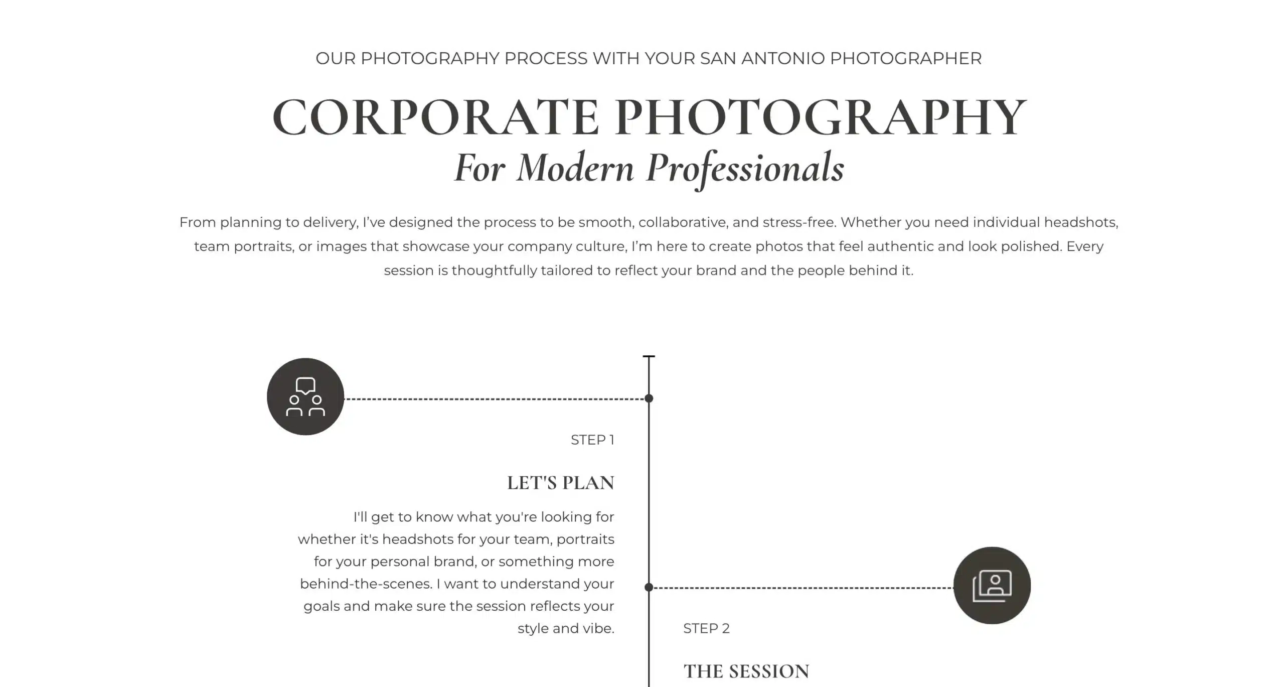
A three-step journey — plan, session, delivery — laid out as an illustrated timeline. High-ticket buyers hesitate because they cannot picture the experience. Showing it removes the friction that pricing pages cannot.
Put the next step everywhere
Contact details sit in a persistent utility bar, a contact button anchors the header, and Schedule a Consultation repeats at every natural decision point. No visitor has to hunt for how to book.
Website redesign decisions that were really business decisions
Audience paths
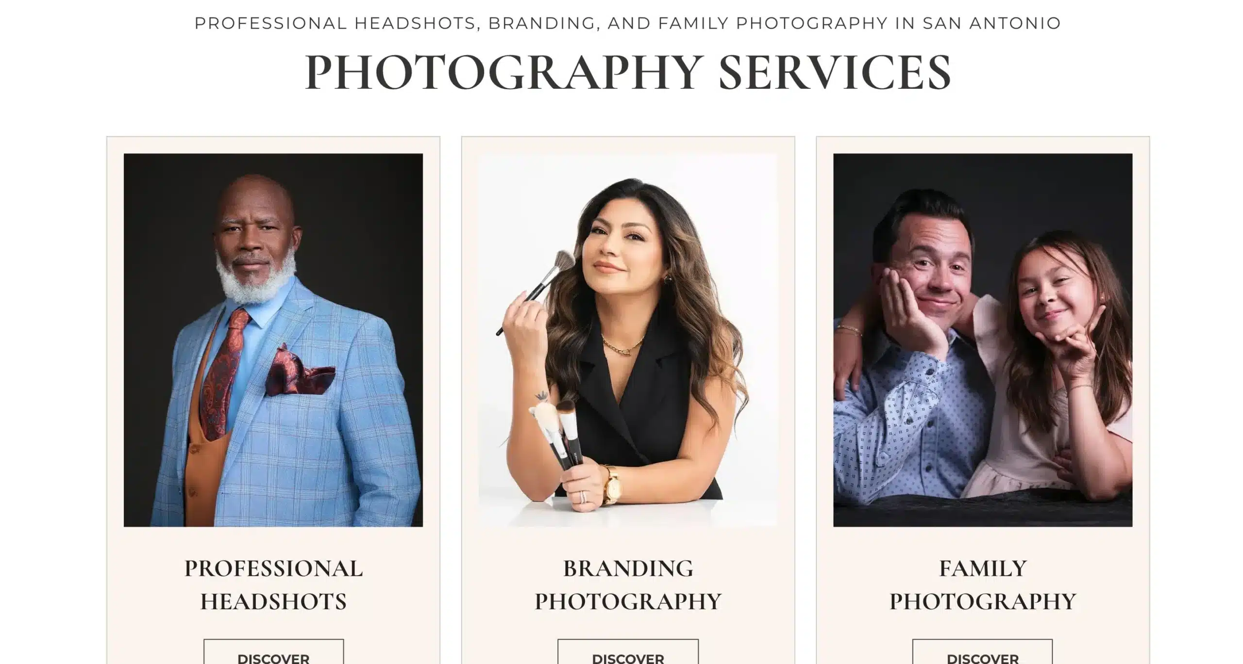
Every headshot type earned its own page, so a search for medical headshots lands somewhere written for a physician rather than on a general services page.
Pages structured
The website redesign mapped service pages, audience pages and surrounding-area pages into one hierarchy rather than added ad hoc over time.
Primary action
Consultation-first. For a considered purchase, a conversation converts better than a booking form, and the whole site funnels toward it.
How the site is performing
A website redesign deserves an honest scorecard, so here is exactly what the data supports.
| Measure | Last month | Prior month | Change |
|---|---|---|---|
| Organic engagement rate | 68.8% | 69.9% | Flat |
| Average engagement time, organic session | 45s | 34s | +33% |
| Interactions per organic session | 6.31 | 6.03 | +4.6% |
| Search clicks, last 28 days | 190 | 167 | +14% |
| Search click-through rate | 0.7% | 0.5% | +0.2pp |
Three honest caveats
First, the rebrand and the new site launched well before the reporting windows Google Search Console and GA4 retain, so there is no clean before-and-after search comparison to show. The figures above are recent month-over-month movement on the live site, not a measure of the redesign itself.
Second, average search position over the same 28 days moved from 19.3 to 24.4 while impressions fell. Clicks and click-through rate rose anyway, which is what tends to happen when a site earns more of the traffic it already had, but we are not going to present half of that picture and hide the other half.
Third, this property has no reliable conversion tracking configured, so we make no claim about bookings, enquiries or revenue. Where a case study of ours quotes a lead number, it is because the tracking existed to support it.
An engagement rate near 69 percent is comfortably above the norm for a local service site, and a 33 percent lift in time on page from organic visitors suggests the content and layout are holding attention. That is the honest read: the site is doing its job well today, and we would rather say that plainly than dress it up as a transformation we cannot evidence.
What the client said
I simply could not be happier with my experience working with FOG Digital Marketing. When I approached them, my goal was to elevate my business to the luxury brand aesthetic that reflects the high-end service I provide to my clients. This meant upgrading everything — my branding, my logo, my colors, and my website.
What stood out the most to me was their ability to listen. They didn't just skim through my ideas or rush the process — they sat down, asked meaningful questions, and really dug into my vision. They wanted to understand not just what I wanted, but why I wanted it.
The website they created for me is stunning — clean, polished, professional, and nowhere near a cookie-cutter template. It's designed with user experience in mind, featuring clear calls to action and a seamless client journey. This was a strategic priority for me, and they nailed it 100 percent.
Matt Roberts, Matt Roberts Photography
Does your brand look like what you charge?
If the work you deliver is better than the way it is presented, that gap is costing you the clients who can afford you. Tell us what you want to be known for and we will show you what a website redesign would take.
Start a Conversation Get a Free Website ReviewHow we approach a branding and website redesign
The same sequence runs behind every website redesign and brand build we take on.
Frequently asked questions
How long does a branding and website redesign take?
For a project of this size — a full identity plus a website of roughly fifty pages — plan on eight to twelve weeks. Identity work runs first and takes two to three weeks including revision rounds, because every page design depends on the system being settled. Build and content take the remainder. Rushing the identity phase is the most common way these projects go wrong.
What does a luxury brand aesthetic mean in a website redesign?
It means restraint rather than ornament. High-contrast serif typography, a narrow palette, generous white space, photography given room to breathe, and a single clear action per screen. What makes a brand read as expensive is consistency and confidence — the absence of clutter, competing colours and hard-sell language. It is achievable at any budget because it is a set of decisions, not a set of assets.
Should a photographer have separate pages for each type of headshot?
Yes, when the buyers are genuinely different. An attorney, a physician and an actor book headshots for different reasons, judge them by different standards and search in different words. Separate pages let you write to each one and let each rank for its own terms. If the audiences overlap almost completely, one page written well beats several written thinly.
Will a website redesign hurt my search rankings?
It can if the URLs change without redirects, if content is cut without replacement, or if the new build is slower than the old one. It usually settles within a few months even when there is an initial dip. The way to protect yourself is to map every old URL to a new one before launch, keep the content that was already earning traffic, and check indexing weekly for the first month. Google's site move documentation is the reference we work from.
How much does a brand identity and website cost in San Antonio?
A combined identity and website project for a service business here generally runs from the mid four figures to the low five figures, depending on page count, how much original photography and copy is needed, and whether e-commerce or booking systems are involved. We price the whole scope up front rather than by the hour, so the number does not move once work starts. You can ask us for a figure against your actual scope.
Do I need new photography for a website redesign?
Usually some. A brand system is only as good as the imagery running through it, and stock photography undercuts a premium position faster than almost anything else. In this case the client is the photographer, so the imagery was never in question. For most businesses we budget for a half-day shoot covering team, workspace and product or service in progress.
What happens after launch?
A website redesign needs someone watching it after launch. We track indexing, Core Web Vitals and search performance for the first ninety days, fix what surfaces, and stay available for the questions that only appear once real visitors arrive. A launch is the start of the measurement period, not the end of the project.
Related work and services
How the identity, the website redesign and the search work fit together.